Customizing Plots
Kyle Baron
2021-09-13
Source:../../../data/GHE/deployment/deployments/2021-09-13/vignettes/customize.Rmd
customize.RmdSet up
library(pmplots)
library(dplyr)

data <- pmplots_data_obs()
A default plot
dv_pred(data)## `geom_smooth()` using formula 'y ~ x'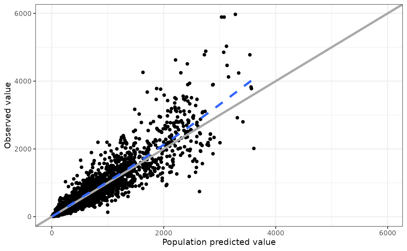
Customize the axis label
dv_pred(data) + labs(x = "Predicted concentration (mg/L)")## `geom_smooth()` using formula 'y ~ x'
Add Greek symbols to an axis label
There are a couple of ways to do this. The easiest is to have the latex2exp package installed and write the TeX right in the label.
dv_pred(data, x = "IPRED//Predicted concentration ($\\mu$g/mL)")## Loading required namespace: latex2exp## `geom_smooth()` using formula 'y ~ x'
Otherwise, you can trigger R plotmath by putting !! at the start of the column label
dv_pred(data, x = "IPRED//!!'Predicted concentration (' * mu * 'g/mL)'")## `geom_smooth()` using formula 'y ~ x'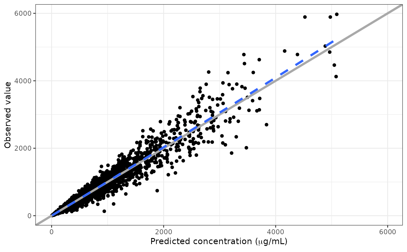
Add a run number or other annotation to the plot
dv_pred(data) + labs(subtitle = "Run 1001")## `geom_smooth()` using formula 'y ~ x'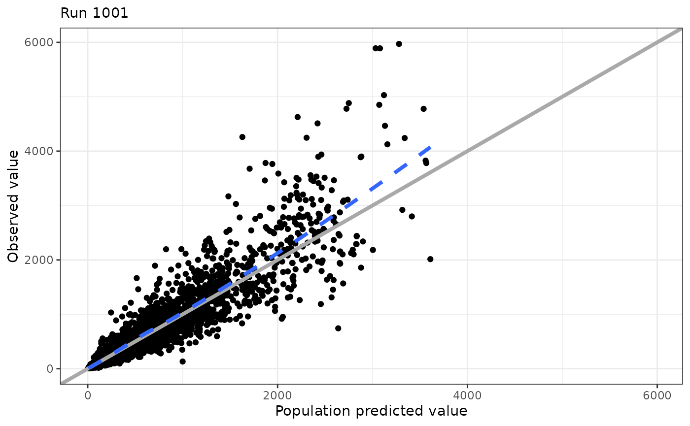
Adopt the pmplots look and feel
At some point, you might have to create a plot outside of pmplots, but you still want to adopt the pmplots look and feel.
p <- ggplot(data = data, aes(PRED,DV)) + geom_point()
p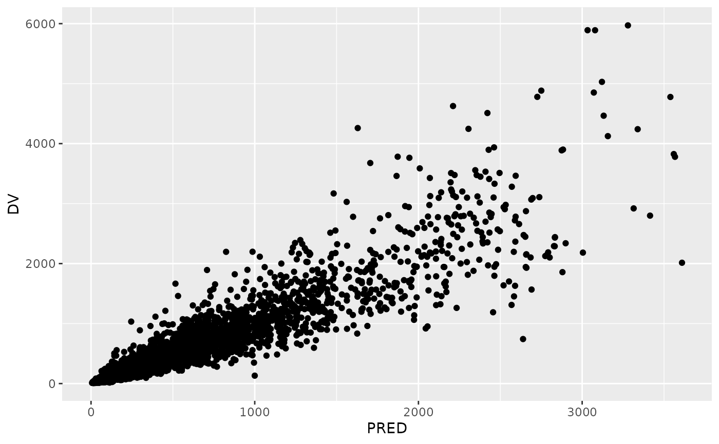
Use these helpers to style the plot
## `geom_smooth()` using formula 'y ~ x'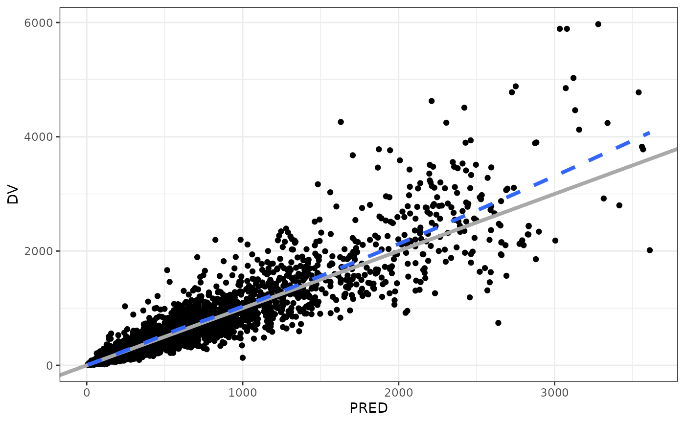
Customize the axis
If you start with this plot
dv_time(data)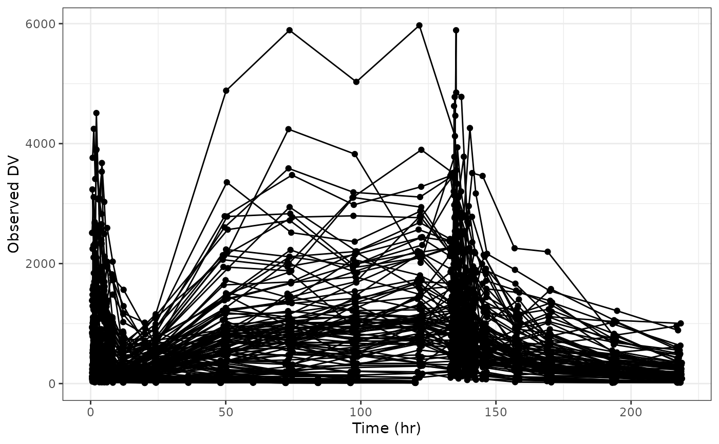
you can use the xs and ys arguments to customize the x or y axis. Pass a list of named data that corresponds to arguments that you would pass to ggplot2::scale_x_continuous() or ggplot2::scale_y_continuous(). For example we can set the breaks like this

But note there is an easier way using xby argument for any of the *_time() plots
dv_time(data, xby = 30)You can put the y-axis on log scale

Again note there is a log argument to this function that lets us do this more conveniently
dv_time(data, log = TRUE)While we’ve had some convenient shortcuts built into some of the functions, this should illustrate how you can control anything related to the axis scales in your plot.
Specifically not that you should not do this
dv_time(data) + scale_y_continuous(trans = "log10")## Scale for 'y' is already present. Adding another scale for 'y', which will
## replace the existing scale.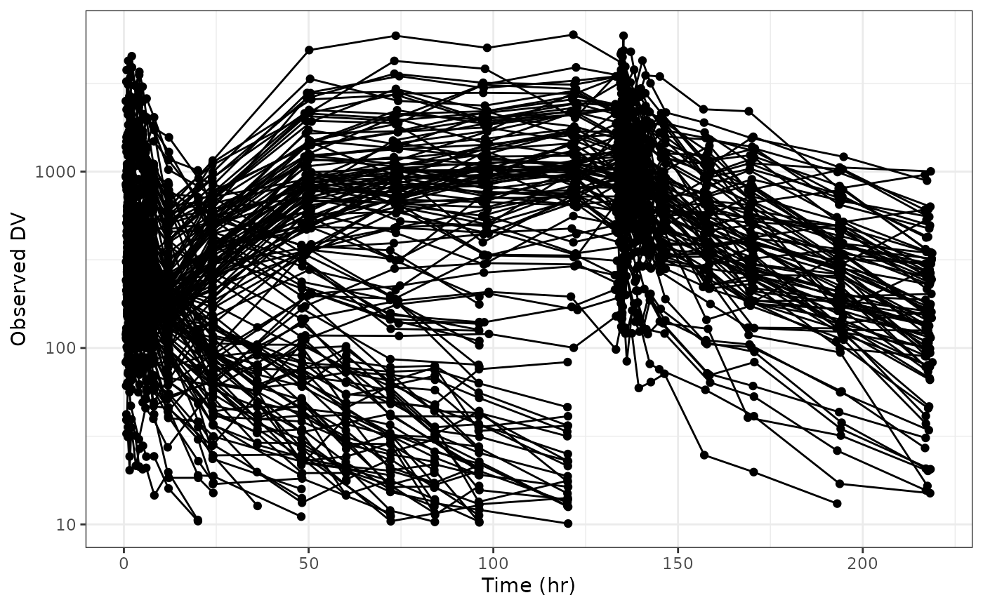
This will result in a warning and clobber the scale that pmplots set. Always customize the axis through xs and ys.