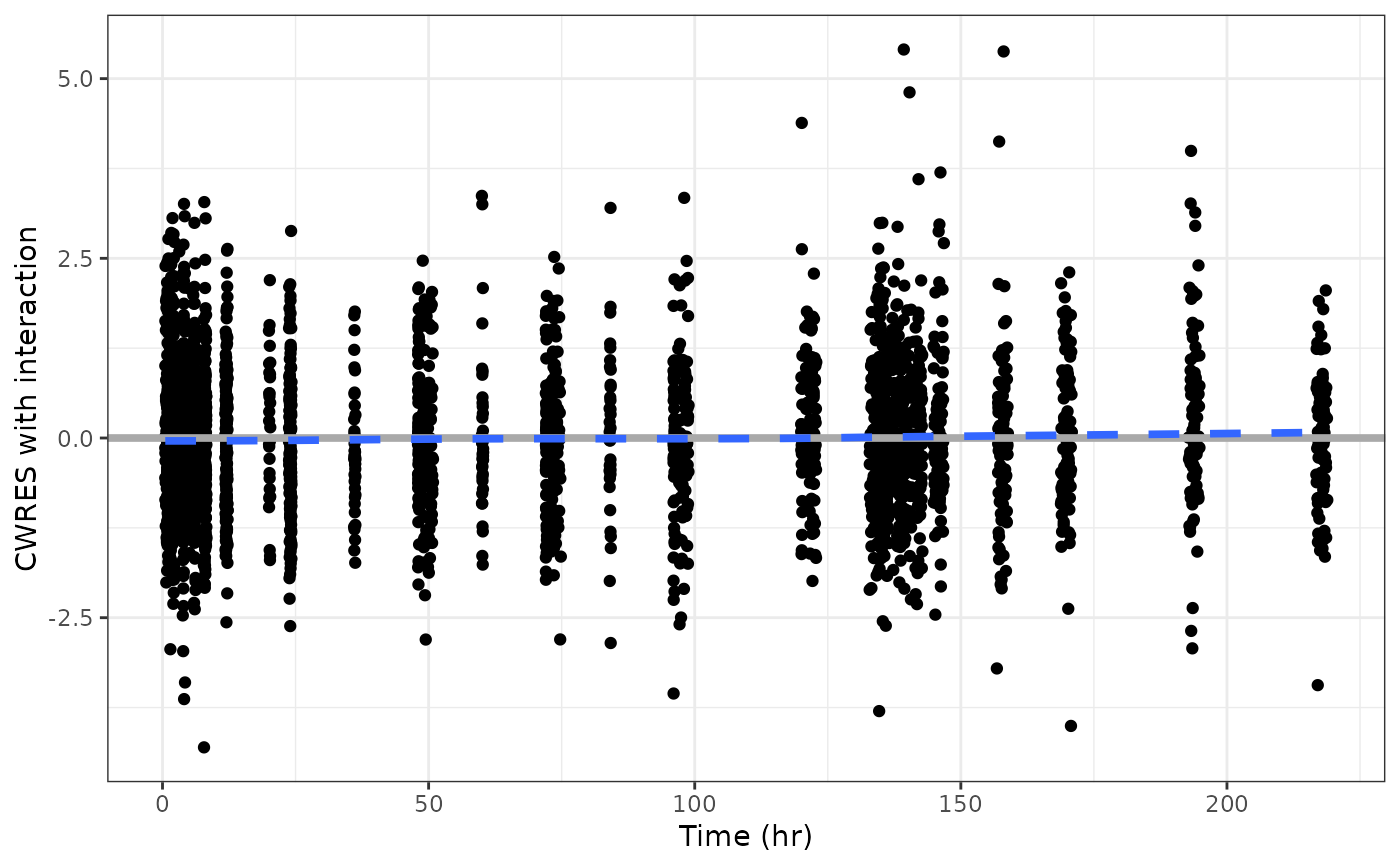
These plots have RES on the y axis and
some time-related column on the x-axis, including TIME,
TAD, or TAFD. Uses y_time to create the plots.
Please see that help topic and details here for other arguments to
customize the plot.
res_time(df, x = pm_axis_time(), y = pm_axis_res(), ...)

res_tafd(df, x = pm_axis_tafd(), y = pm_axis_res(), ...)

res_tad(df, x = pm_axis_tad(), y = pm_axis_res(), ...)
Arguments
| df | data set to plot |
|---|---|
| x | x-axis data in |
| y | y-axis data in |
| ... |
Value
A single plot.
Details
Plots are generated using y_time,
which then calls scatt.
By default, the time unit is assumed
to be hours (hr). See the xunit argument
to y_time to change the time unit.
See the xby argument to y_time for a
convenient way to change the breaks for the x-axis (time).
Since this function creates a scatter plot,
both the x and y columns must
be numeric.
See also
Examples
#>